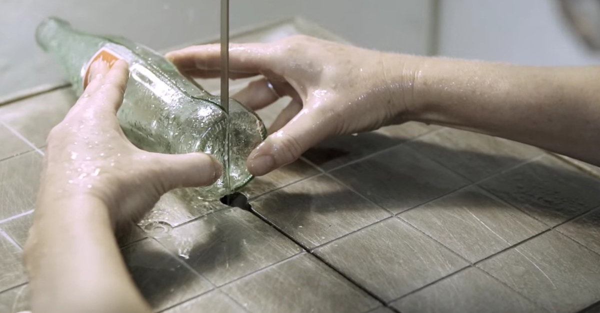
The iconic Coca-Cola bottle is a shapely glass vessel that is known literally the world over. The Coca-Cola logo itself is one of the most widely recognized symbols ever designed. As it turns out, the beautiful design of these bottles was something of an accident. You see, the man responsible for the design, Earl R. Dean, of Terre Haute, Indiana, went to his local library to search for information on Coca-Cola’s main ingredients: coca leaves and kola nuts. He was hoping to base the shape of the bottle on these ingredients. What a different bottle it would have been if Earl had found anything! Apparently these ingredients were a little too exotic for Terre Haute’s book collection, or maybe Earl didn’t know the difference, but he found an image of a cocoa pod in an encyclopedia and rolled with it. Coca-Cola and Chick-fil-A are two companies that share both a hometown (Atlanta) and an apparent love of hyphenated, self-evidently descriptive brand names. So when Chick-fil-A turned to glass artist Kathleen Plate to design new chandeliers for their restaurants, she knew just what to do. Also based in Atlanta, Kathleen uses a very clever process to turn the curvaceous bottles into something a little flatter but still immediately recognizable. H/T: Chick-fil-A Read more: http://www.wimp.com/lady-makes-amazing-chandeliers-for-chick-fil-a/
Read More...
